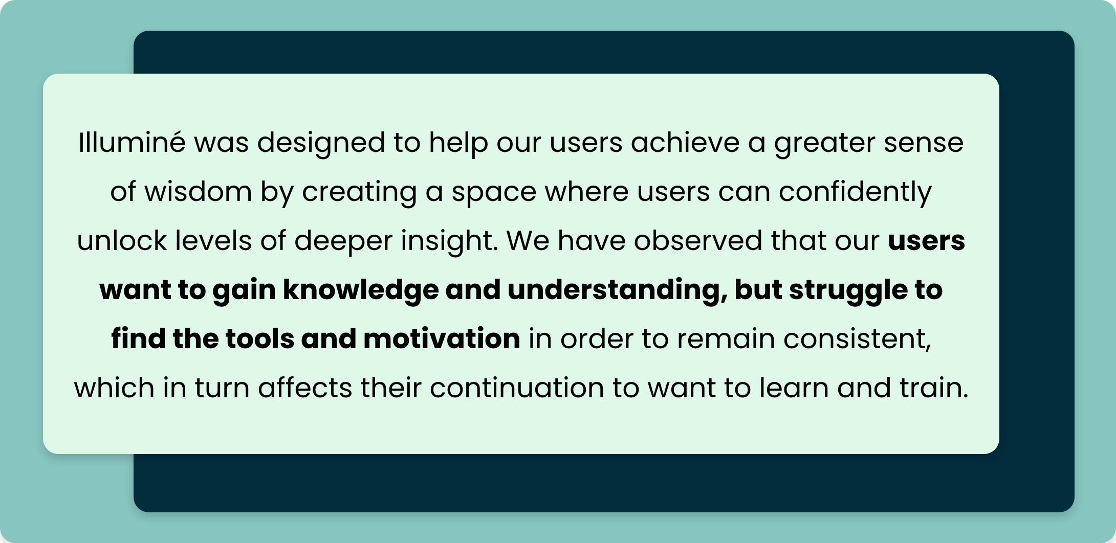
illuminé
illuminé combines the pillars of wisdom offering skill courses and opportunity for reflection so that users can create solid connections that result in conscientious decision making.
TIMELINE:
Two and a Half Weeks
MY ROLE:
UXR
UX
UI
TEAM
Emma Jaud, Angel Newball, Dalia Bolton, Howard Yung, Annie Szarmach
MY MAIN TASKS
Wireframing
Prototyping
Data Synthesis
Information Architecture
DESIGN & RESEARCH TOOLS
Figma, Miro, Google Drive, Zoom, Adobe XD, GSuite
THE PROBLEM
People do not have the tools to train on wisdom skills. They seek knowledge and understanding, but have nowhere to attain that in a guided-learning setting that illustrates the value of wisdom and well being.
OUR SOLUTION
illuminé offers wisdom skill courses and opportunity for reflection so that users can create solid connections that result in conscientious decision making. illuminé combines the pillars of wisdom allowing users to pursue their potential individually and independently.
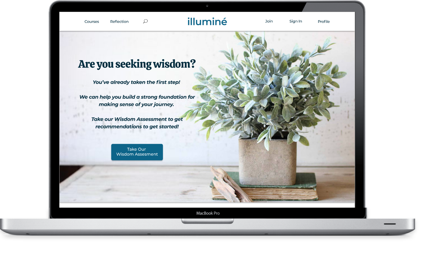
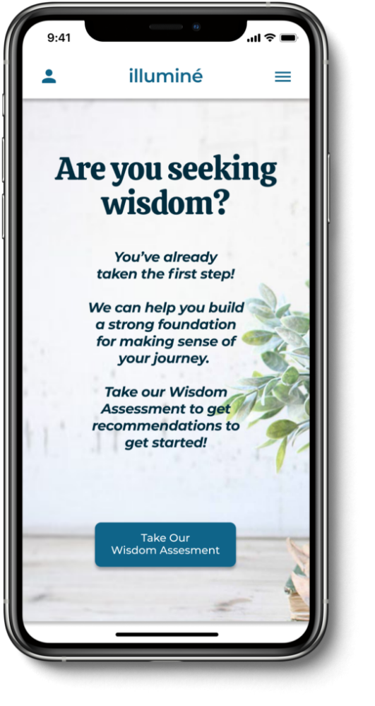
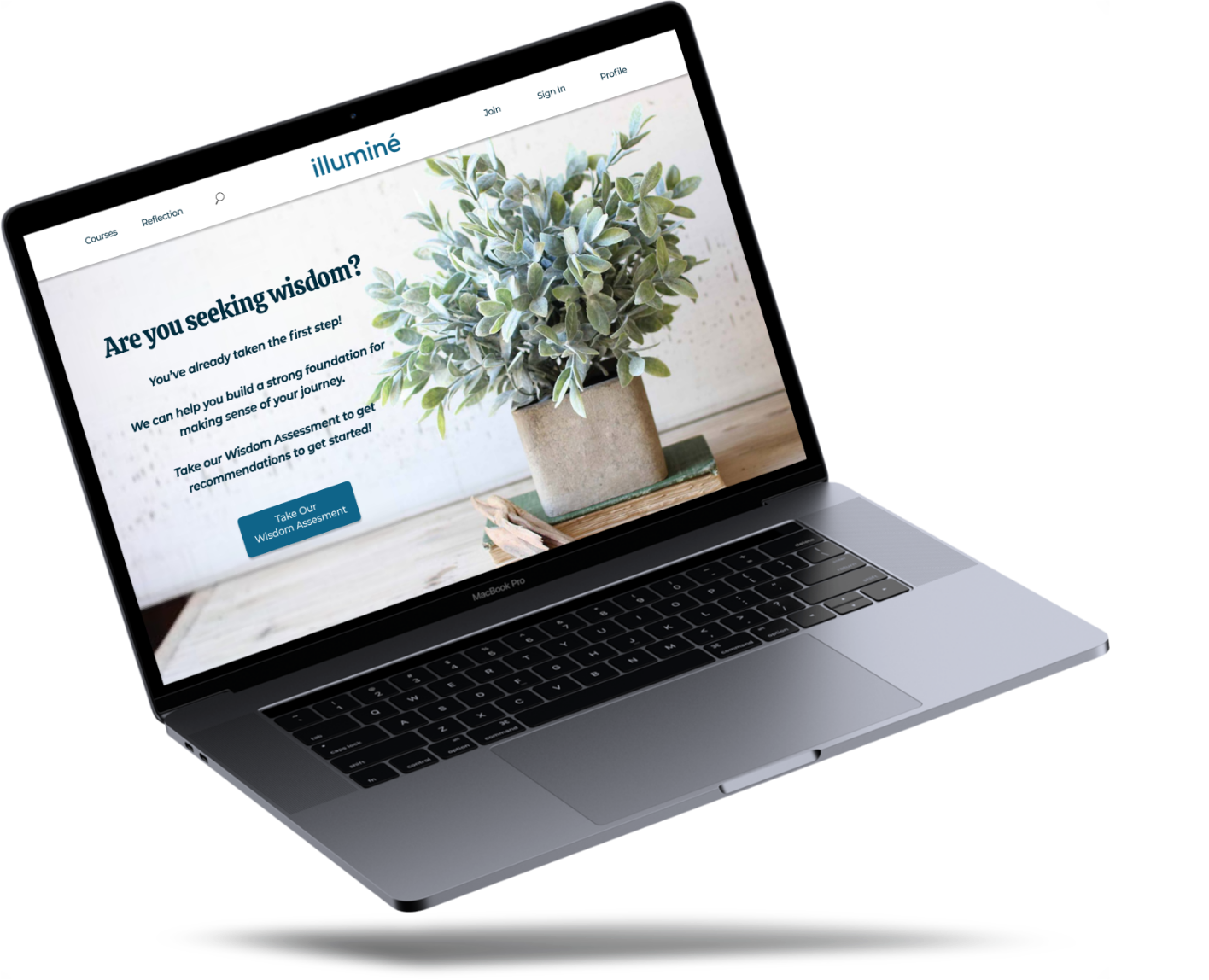
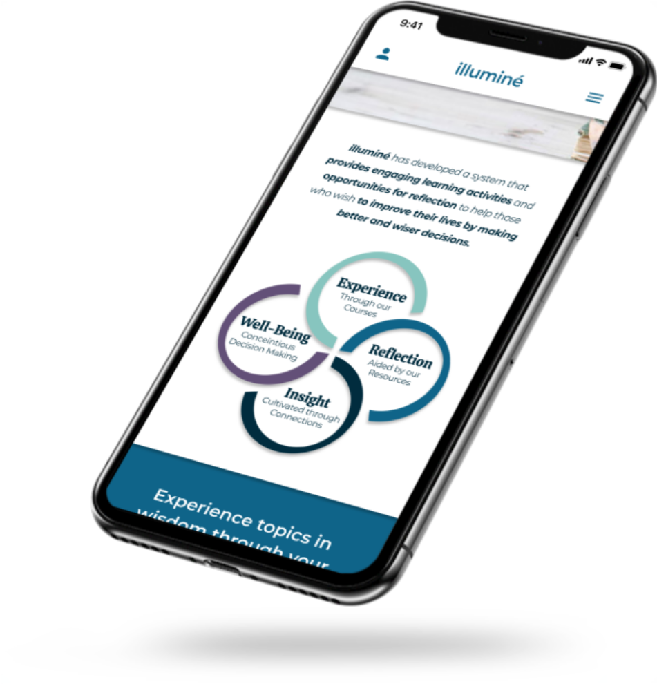
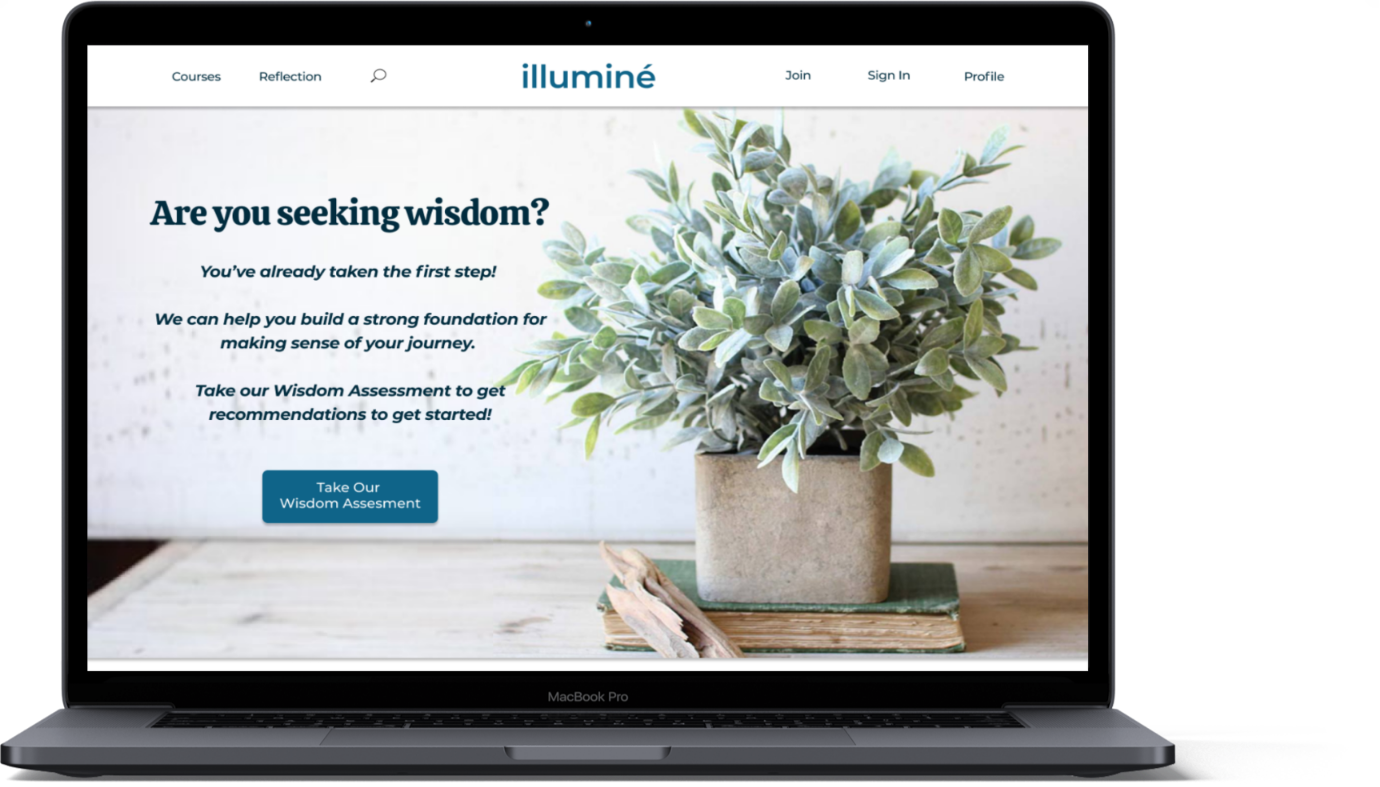
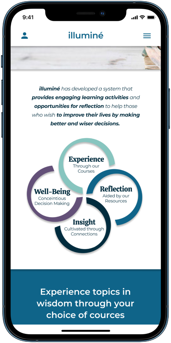
Click on either device to view prototype
Background Research
Global Wellness Economy
The Global Wellness Economy is a 4.5 Trillion Market industry that branches off into a variety of billion dollar markets.
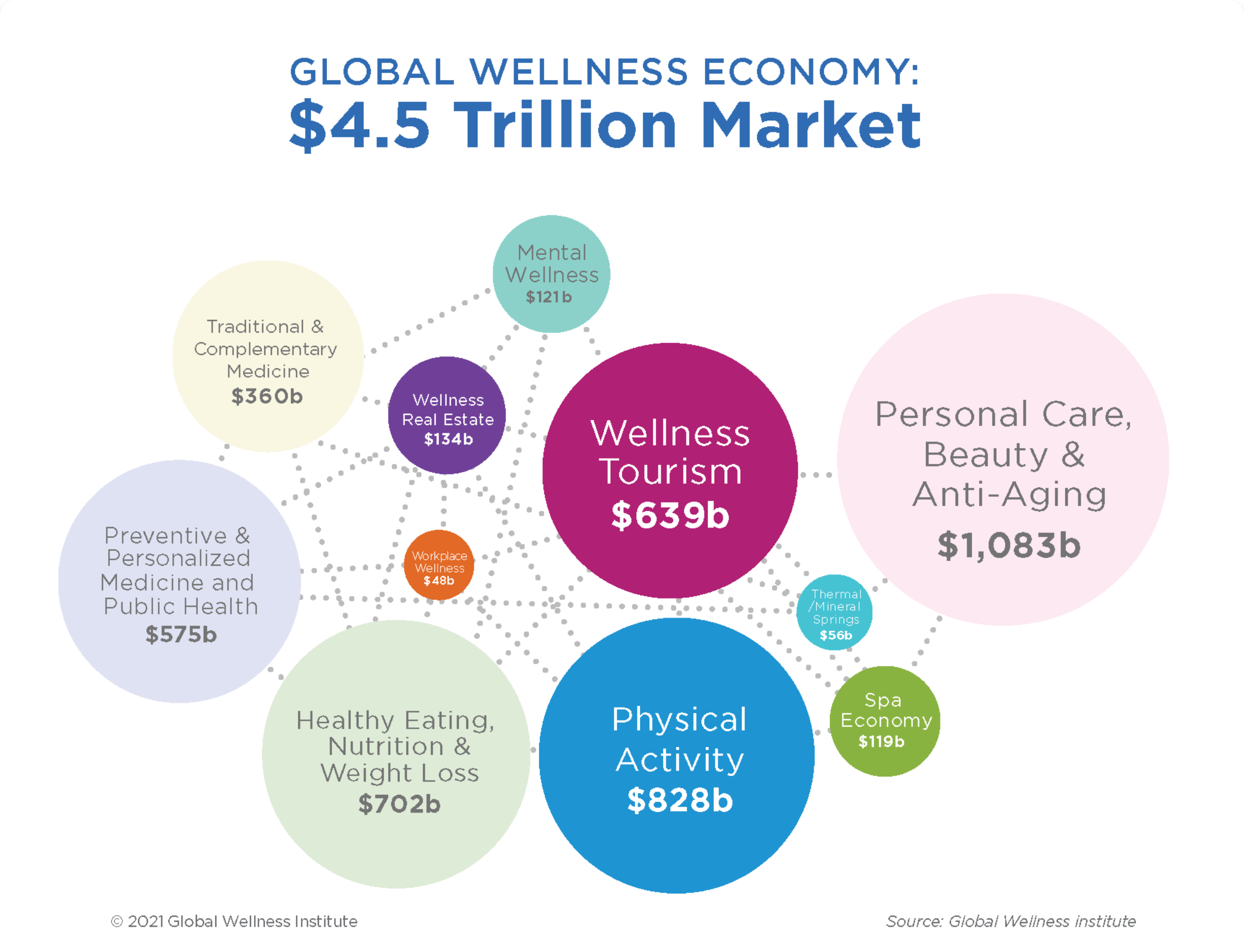
Digging deeper we discovered that the concept of growing wisdom is not represented within this realm. It has the potential to be a viable market, but as of now its untapped and unrepresented.
Stakeholders Vision
Our stakeholder’s vision is to push the concept of wisdom into the industry.
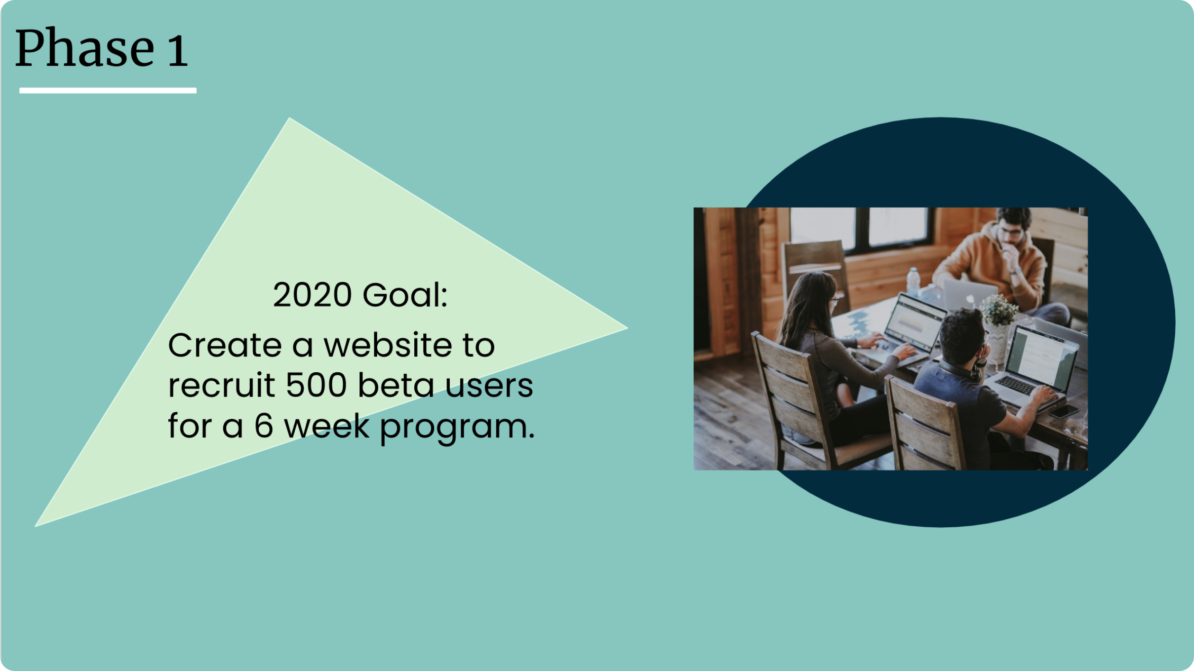
The first phase would include a responsive website in order to recruit 500 beta users for a 6 week program.
User Research
User Interview Plan
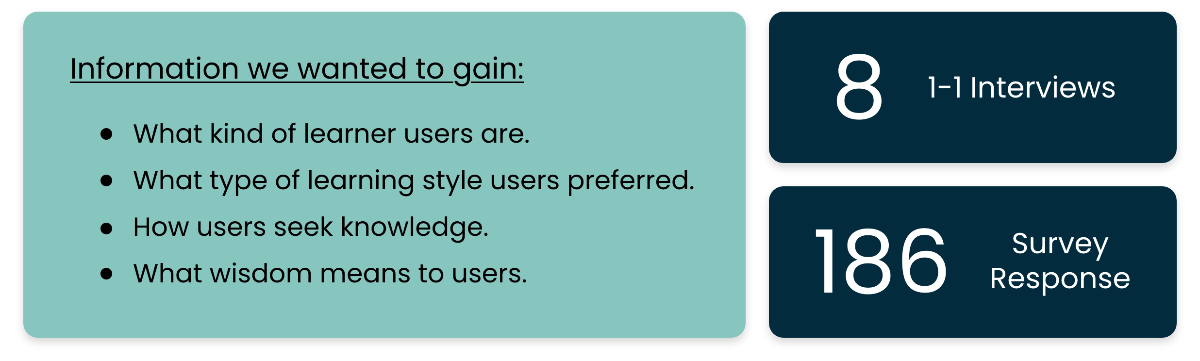
Our team started off by conducting a total of eight 1 on 1 user interviews and deploying 1 survey which brought us back 186 responses.
Supporting Information From Survey
From our survey, our team gained this information.
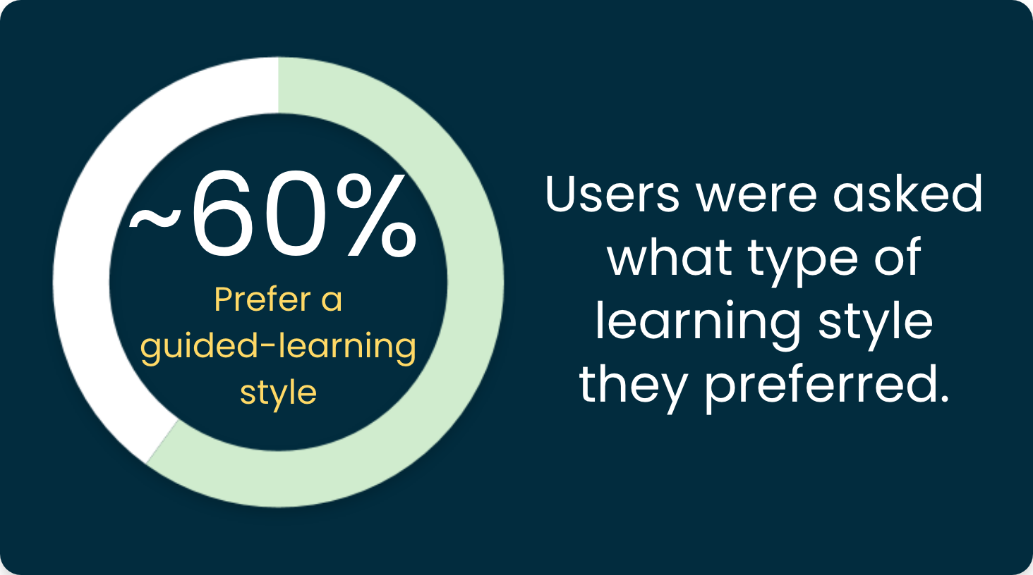
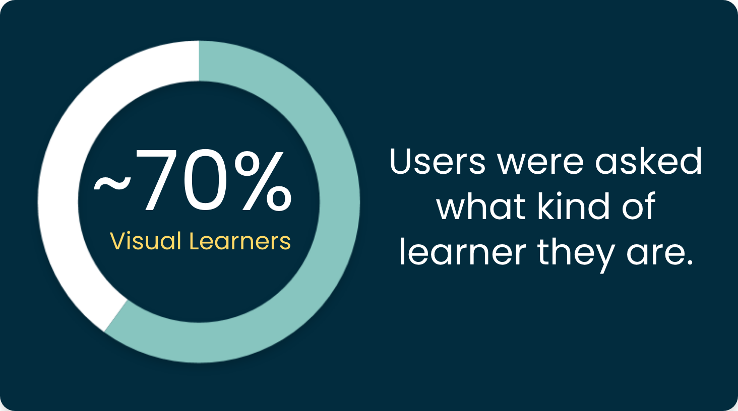
This let our team know which direction to take steps towards for our website.
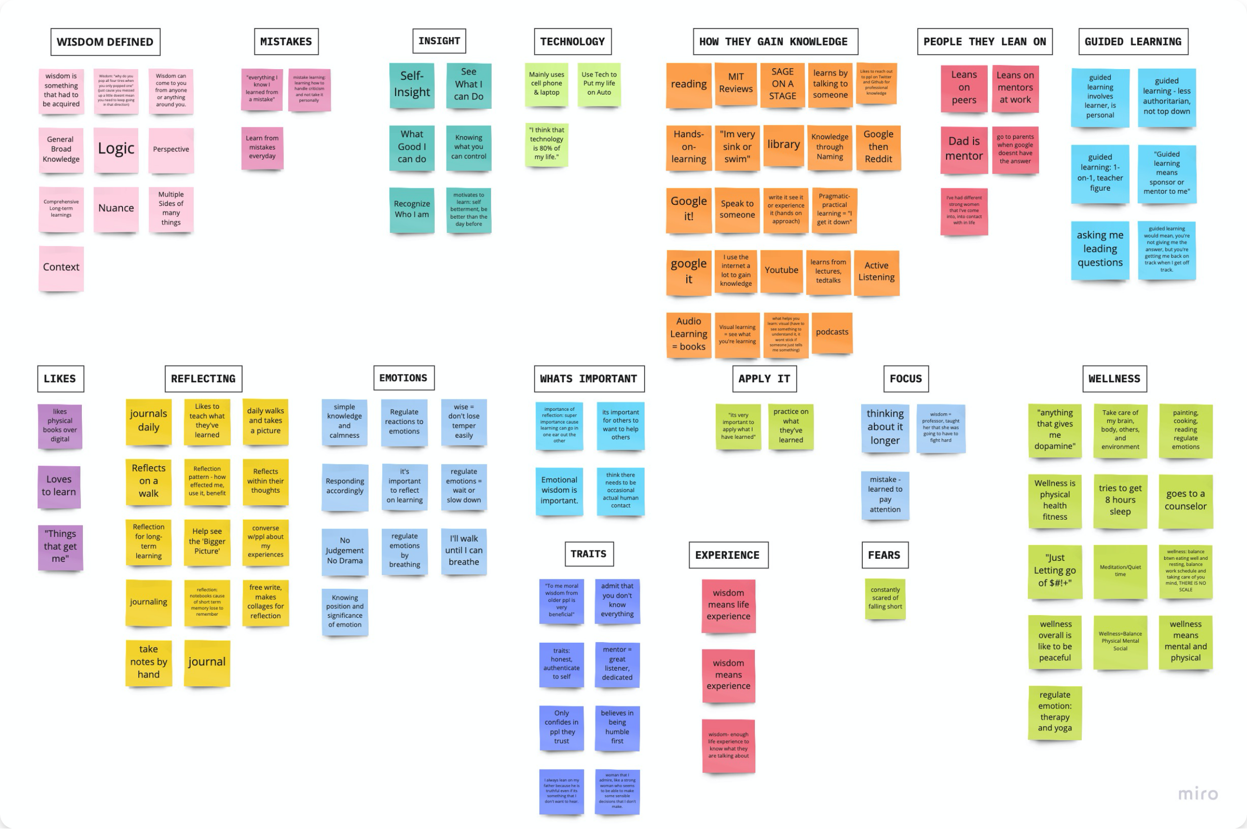
Affinity Diagram
As a team we grouped the data collected from the user interviews and survey into ideas and categories in order to find patterns.
Empathy Map
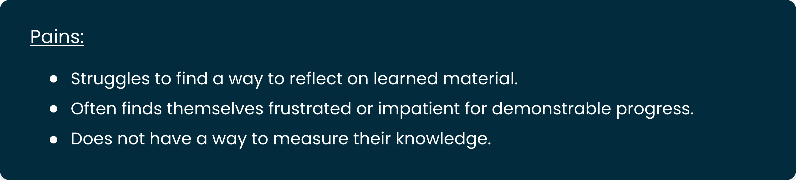
As a team, we synthesized our findings from our interviews and survey responses into an empathy map to capture and gain a deeper insight into our users.
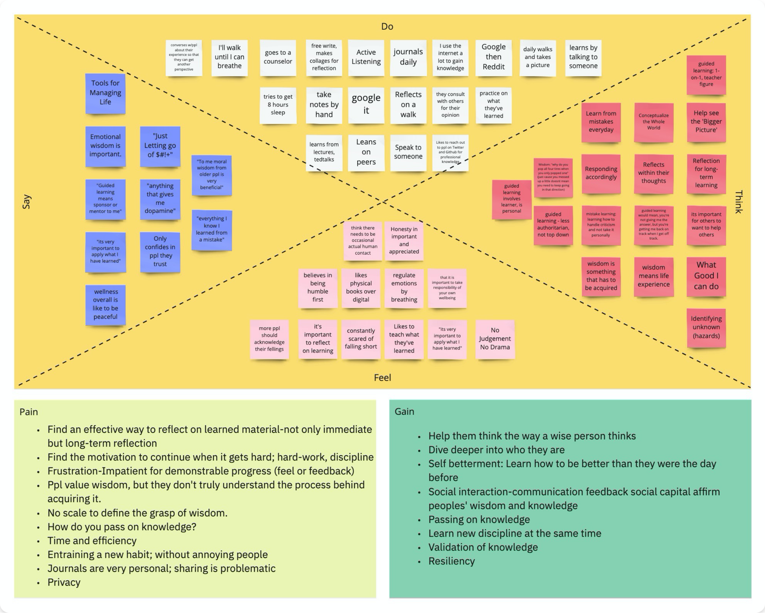
By creating an empathy map we were able to narrowed in on our user’s pains. We discovered that our particular type of user…
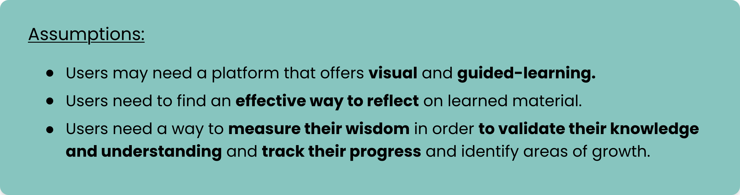
Assumptions
With the findings we have discovered so far our team camp up with a few assumptions.
Definition & Ideation
Problem Statement
With all of the findings from the research and analysis in mind we Defined a Problem Statement.
This helped us focus our efforts toward developing features for users to be empowered when exploring the intersection between learning and motivation or mind and action.
Competitor Analysis
We conducted a Competitor Analysis of 9 Products in the Field of Well-Being, Mind, and Learning
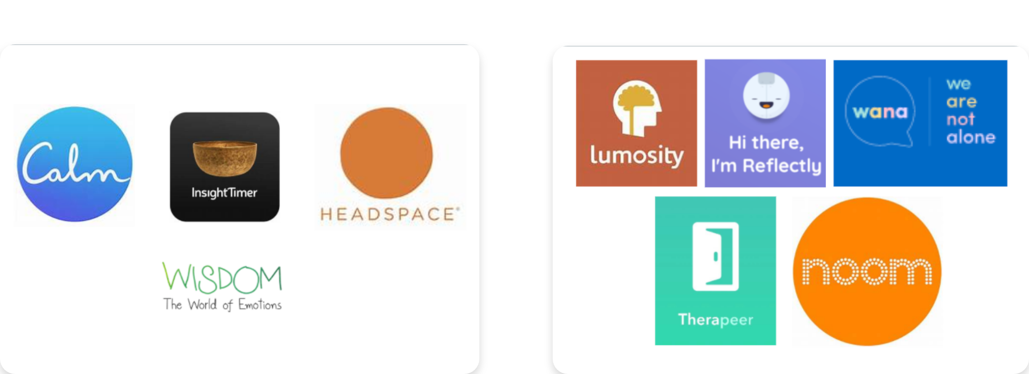
Main Takeaways:
- Onboarding is very clearly focused on mental and physical well-being...
- Meditation, Mindfulness, Memory, and Mood
- Stress, Sleep, and Anxiety
- Cards and Buttons foster Usability via Efficiency, Learnability, Satisfaction/Enjoyment, and Memorability.
- Users need to pay for any substantial benefit (e.g. customized plan, full access to content, and all features operable); coded as ‘Unlock’!
Value Proposition
Our team laided out the Pains and Gains identified during User Research on a Value Prop Canvas and then Creatively Defined what Pain Relievers and Gain Creators could solve those problems and generate opportunities.
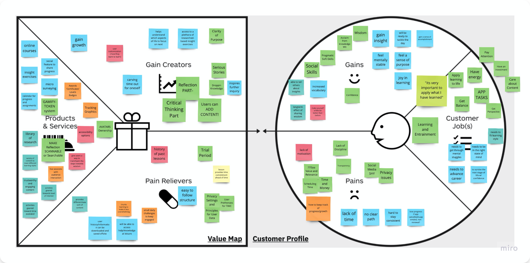
We then asked “How Might We? Questions and brainstormed to generate What Products/Services as Features that would specifically do those things.
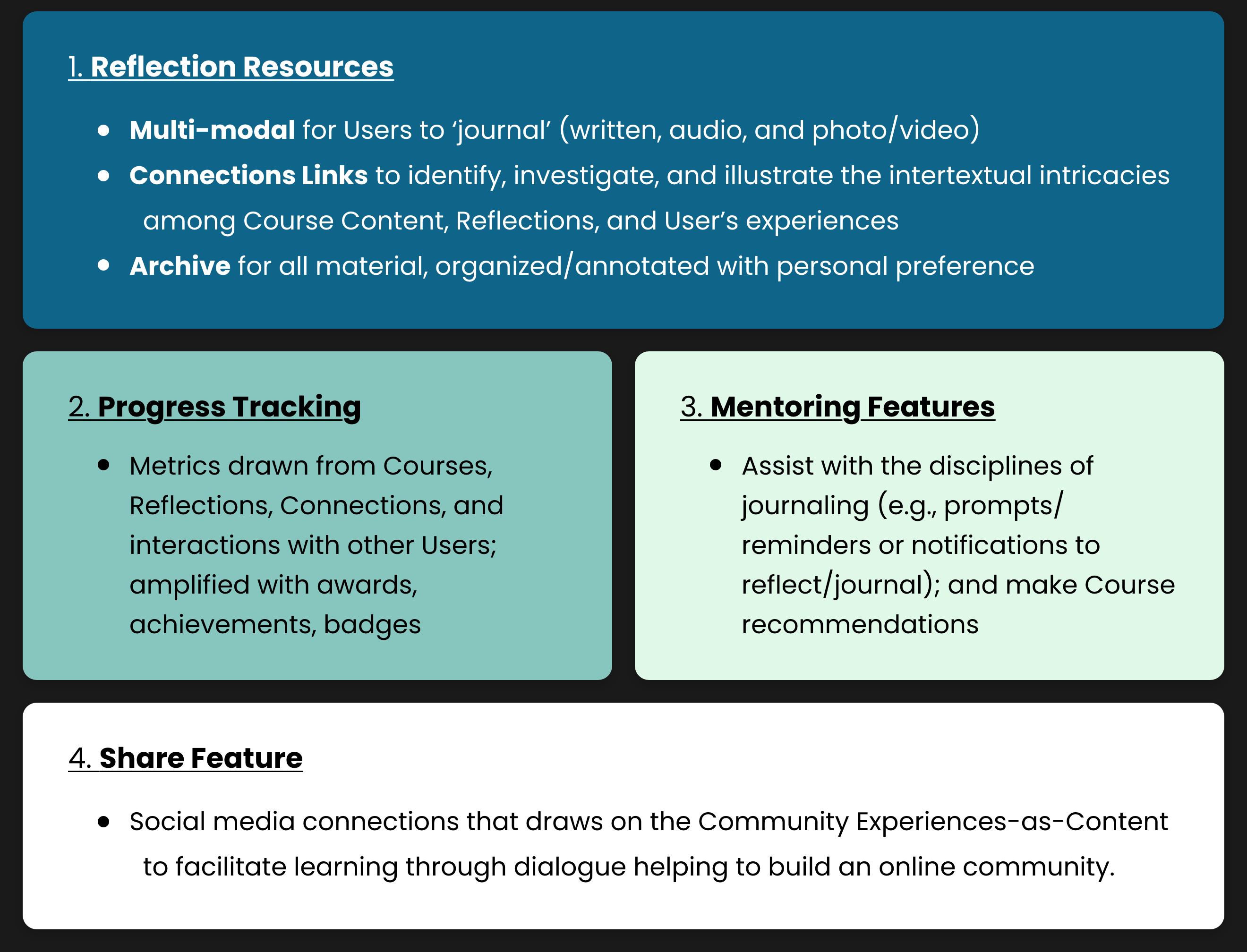
Feature Categories
With our synthesized data we came up with 4 feature categories.
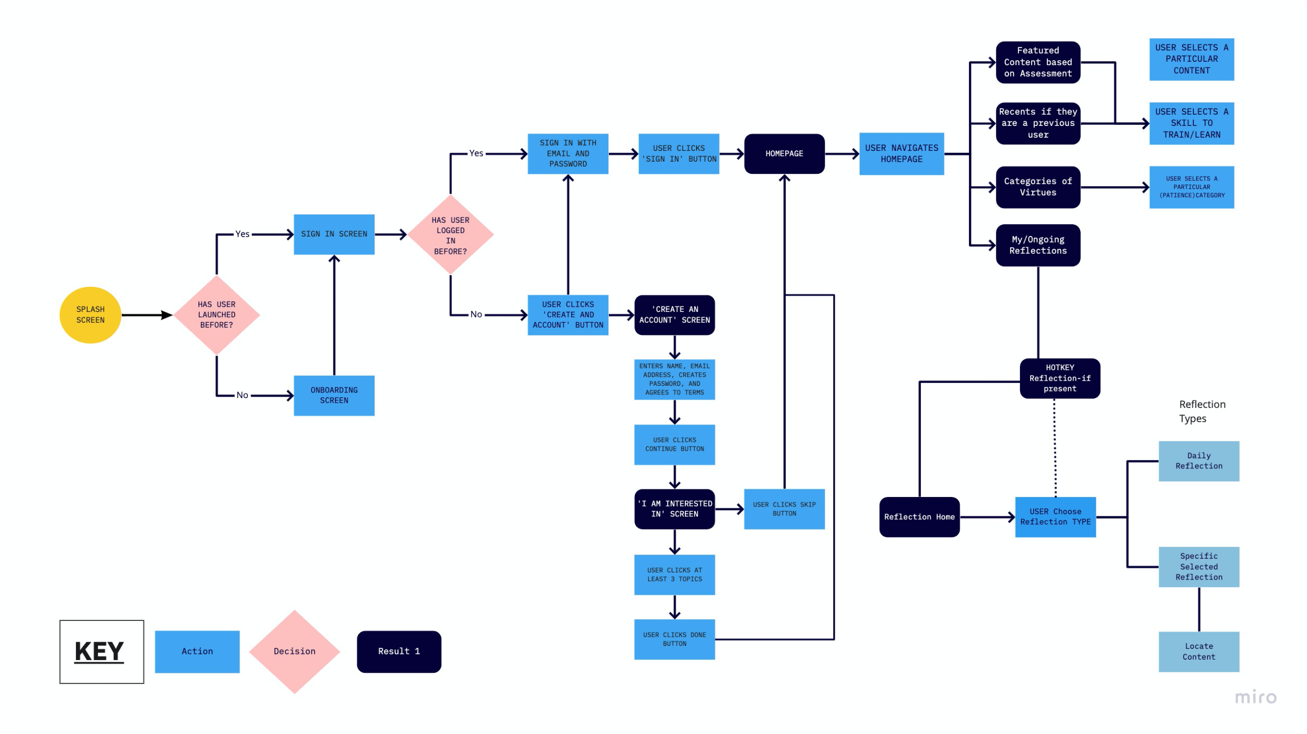
User Flow
Now that we determined some tangible features, we needed to incorporate them into a Website, so we collaborated to build up a User Flow.
Wireframing & Prototyping
Lofi Mobile Wireframes
Our team started off by wireframing some low fidelity mobile wireframes based off our user flow.
Once we finished this initial prototype we had a meeting with our stakeholders to get some clarity on some discrepancy we were running into based on what the content of the app would have.
In that meeting our stakeholders clarified what they were leaning towards which was a Responsive Website rather than an app and so we had to pivot our game plan.
V.1 Desktop Wireframes
Our team decided to start over and we created some desktop wireframes.
In our version 1 our team wanted the home page to tell the user the features that could be utilities in this website.
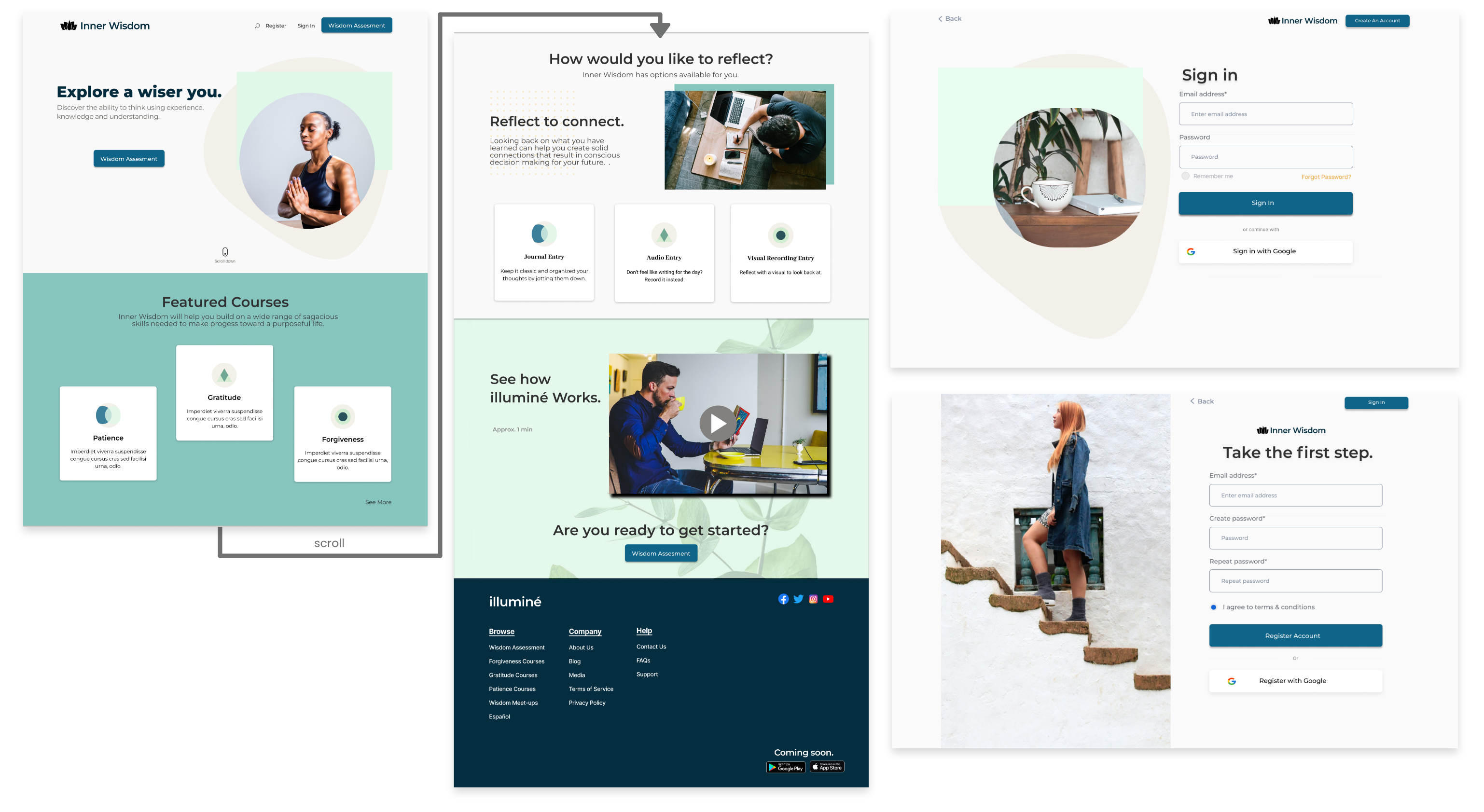
Once we determined a baseline to go off of we started iterating v.1 wireframes to be able to start testing later on.
V.2 Desktop Wireframes
Due to time constraints we decided to focus on the major features, In v.2 we made our features clearer on the homepage, solidified our login and sign…
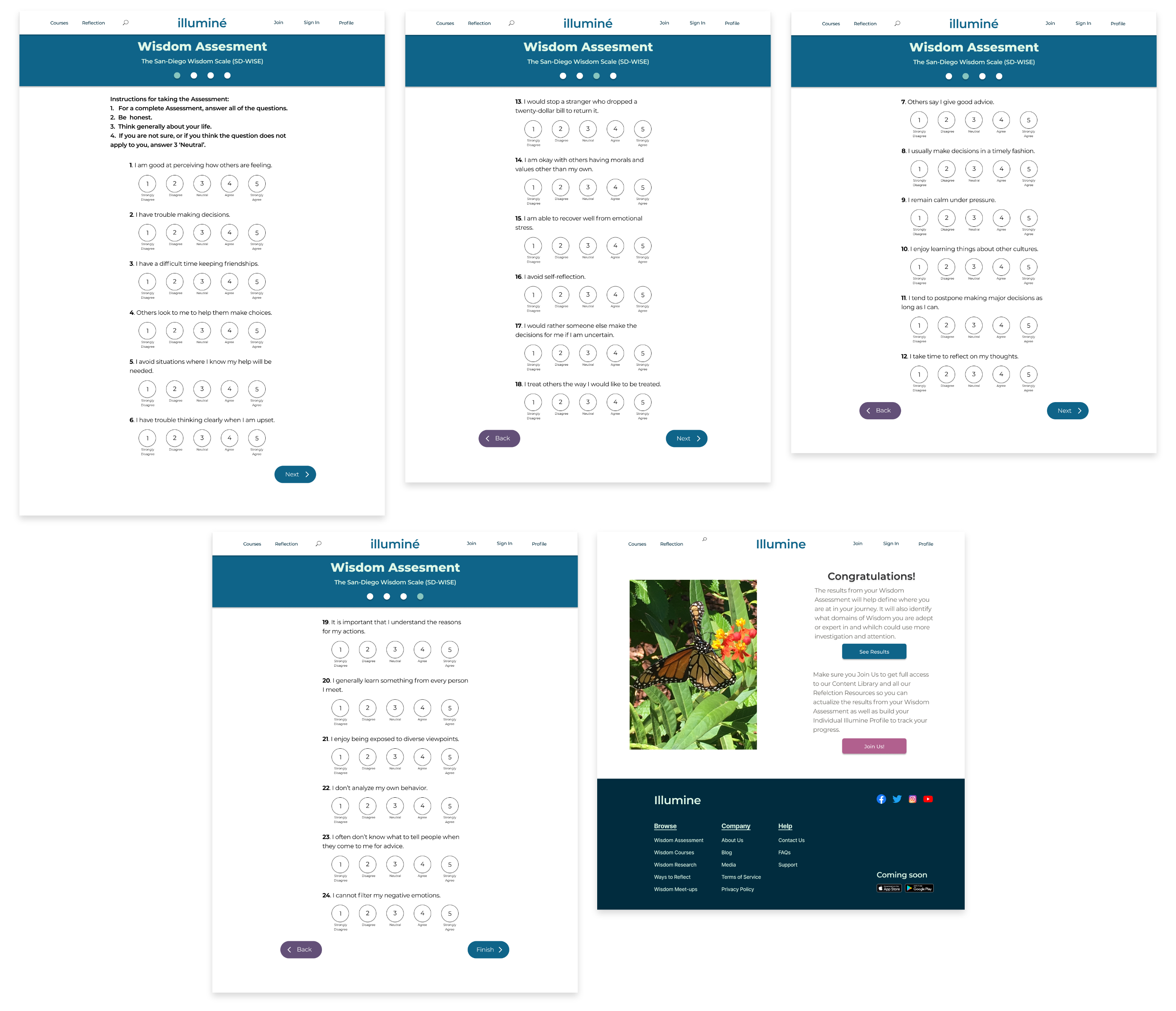
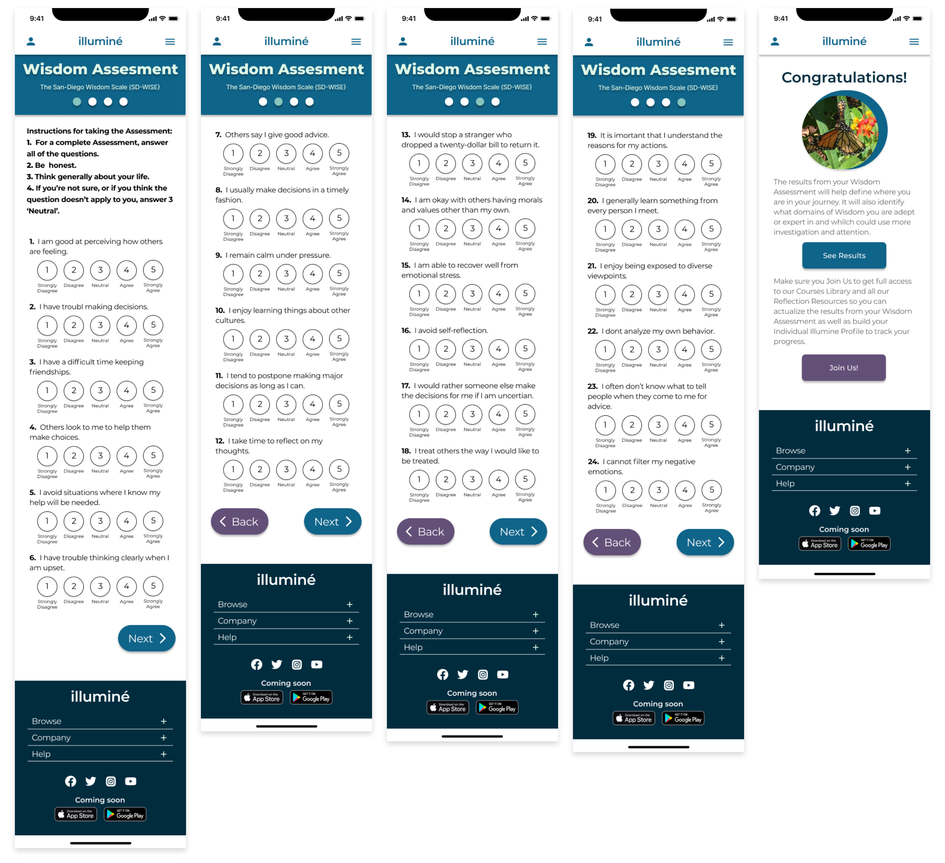
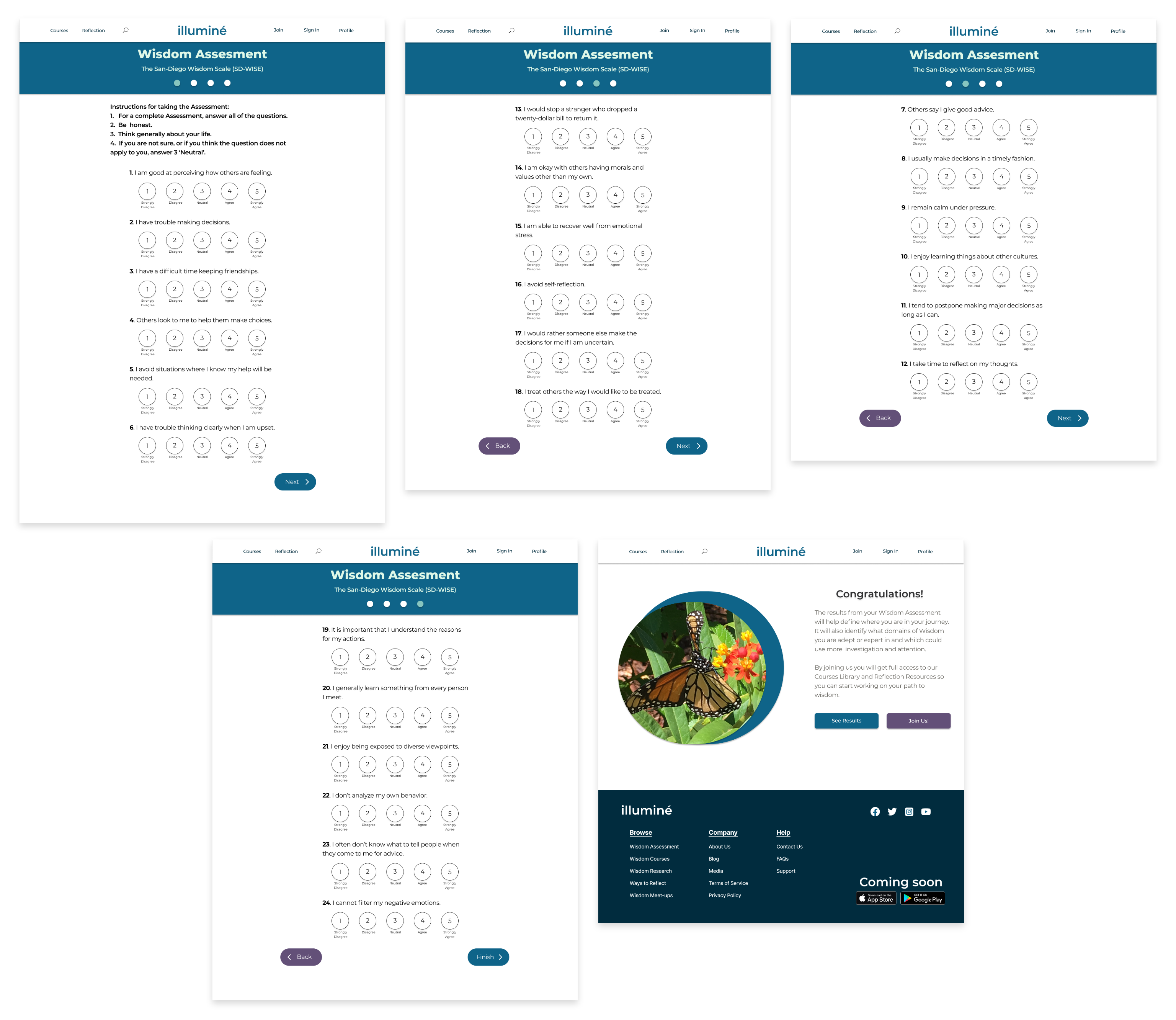
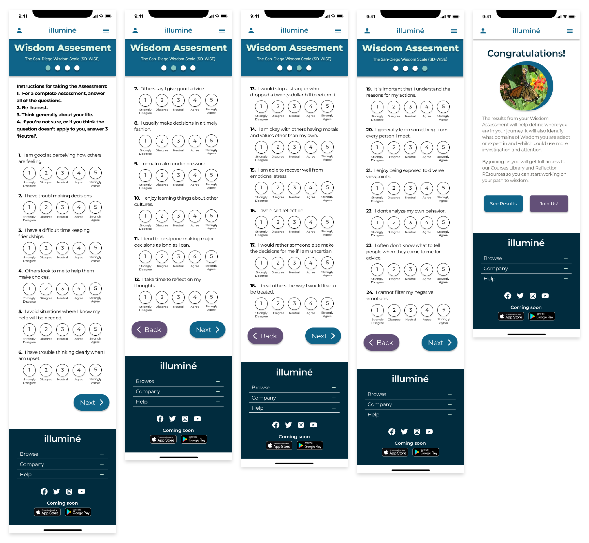
…as well as added a wisdom assessment that our stakeholder was going for in her original idea. We used Sd.wise scale for wisdom for our wisdom assessment.
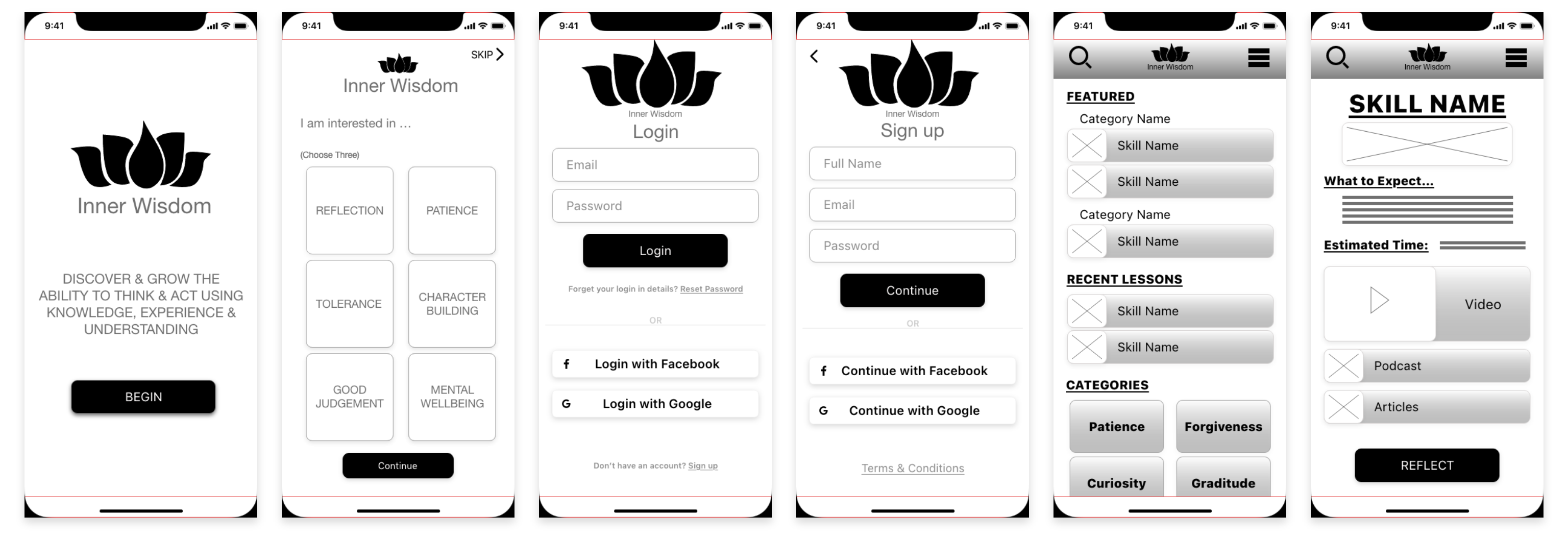
V.2 Mobile Wireframes
Once our team was confident with the v.2 version we created mobile wireframes to get a sense of how we could make our website responsive.
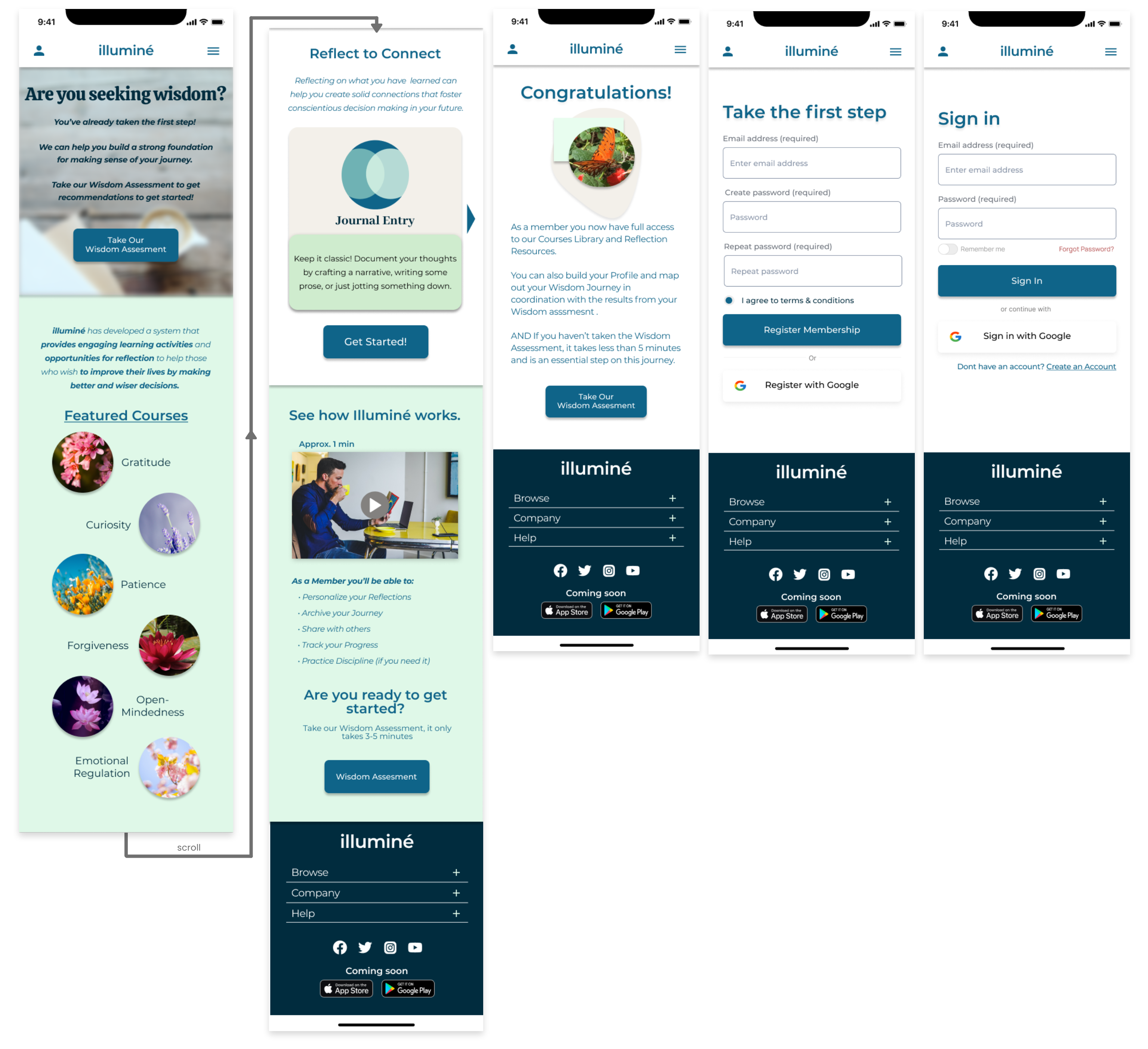
As well as the Mobile Assessment wireframes.
Testing & Iterating
Usability Testing
We conducted a usability test on 5 users.
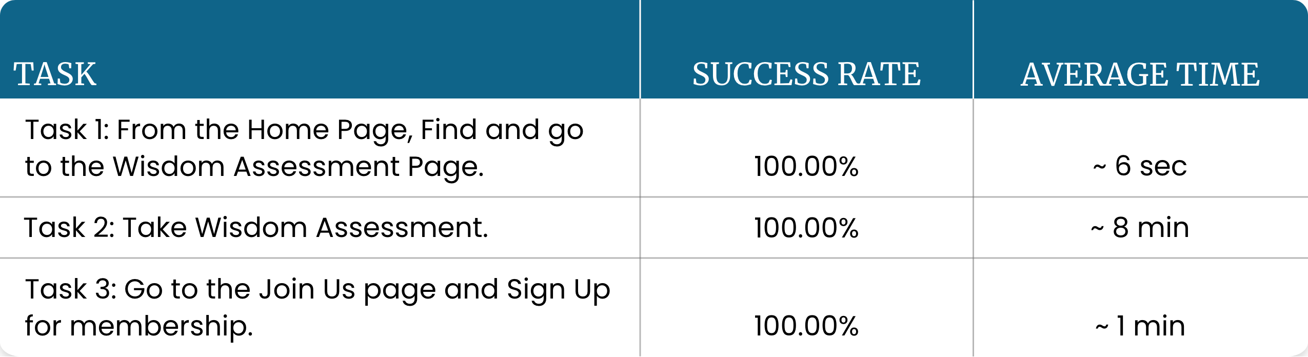
We learned that our users found it easy to to complete the tasks of locating and taking the wisdom assessment and to sign up for a membership.
Main Takeaways:
- Testing revealed no substantial error or problems with our navigation or direction for the tasks
- Confusion about where a user would go on the website for the next step of their journey.
- 4 out of 5 users were unclear about our features and their purpose when asked.
Style Guide
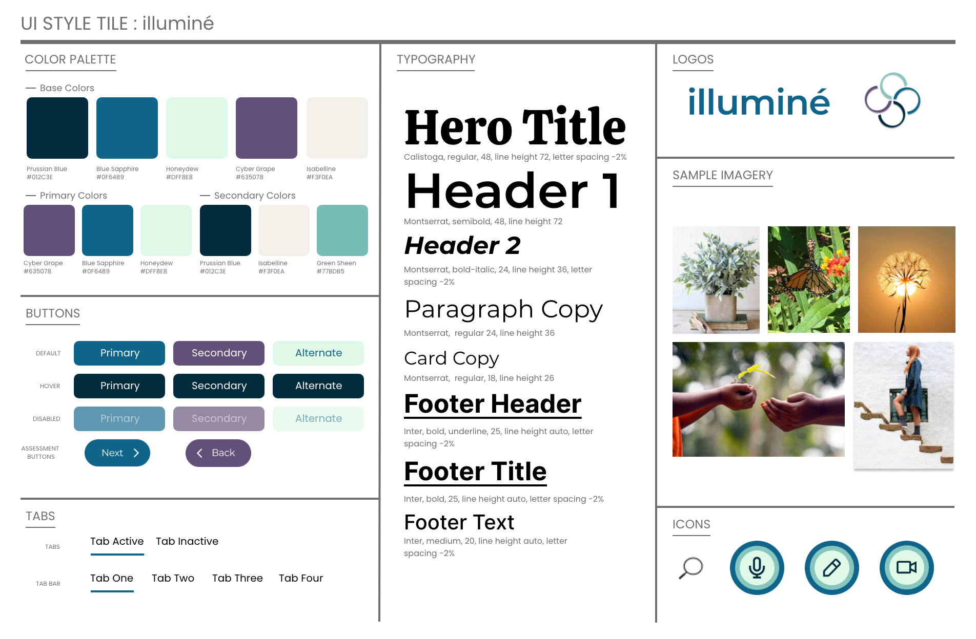
UI STYLE DIRECTION:
In this process of creating this website, we need to define a “voice” or design scheme that communicated the stakeholder’s vision.
We finalized details for typography, button states, icons, and more. These guidelines were applied to the desktop and mobile prototypes.
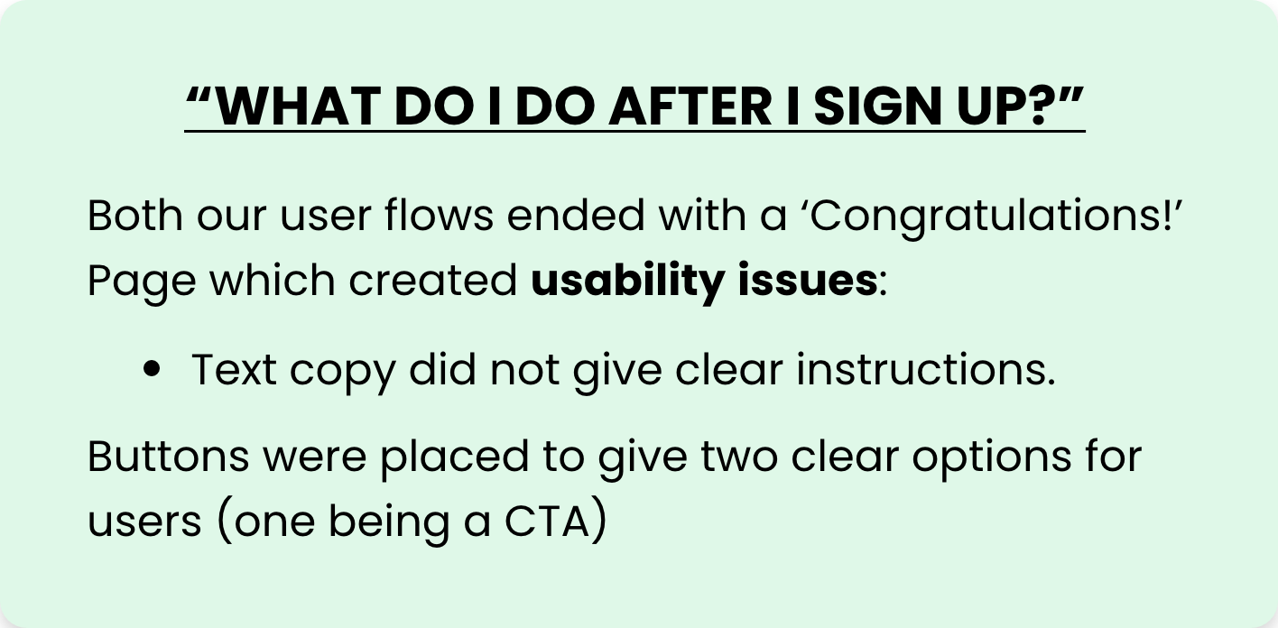
User Flow Iterations
We improved the flow by editing the text copy and buttons were placed to give two clear options, including a CTA.
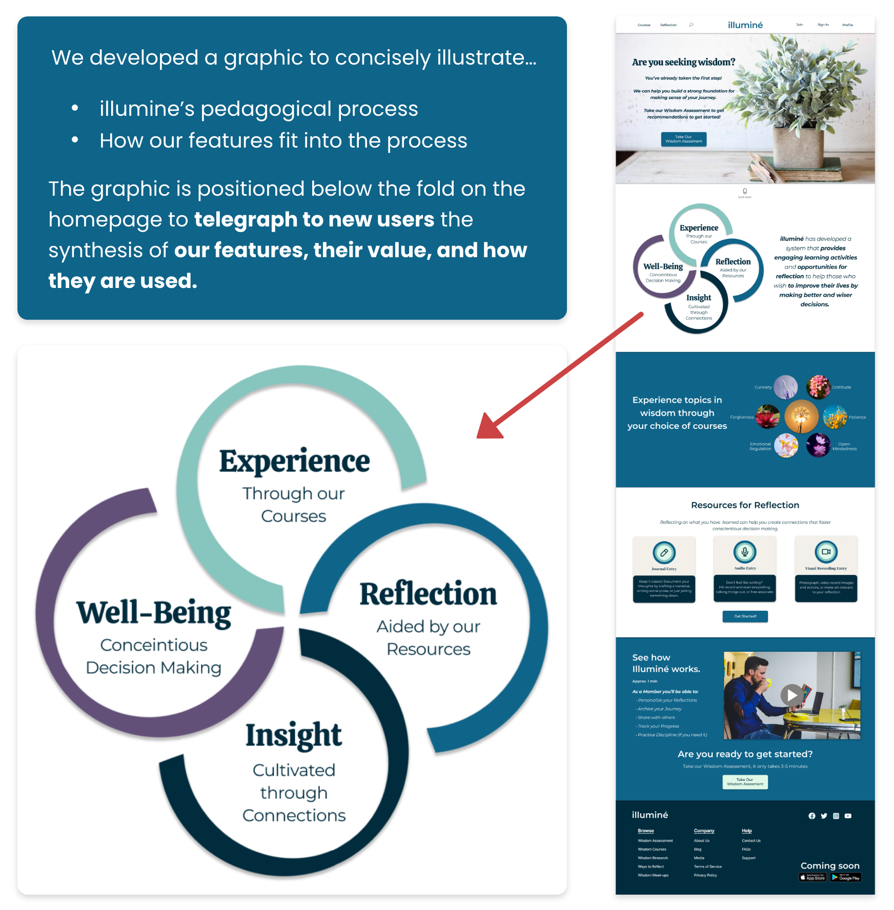
Wisdom Cycle of Learning
From our usability testing our biggest insight was that we learned that our users didn’t understand the central purpose of illuminé’s features. We dove deeper into our design to alleviate this confusion..
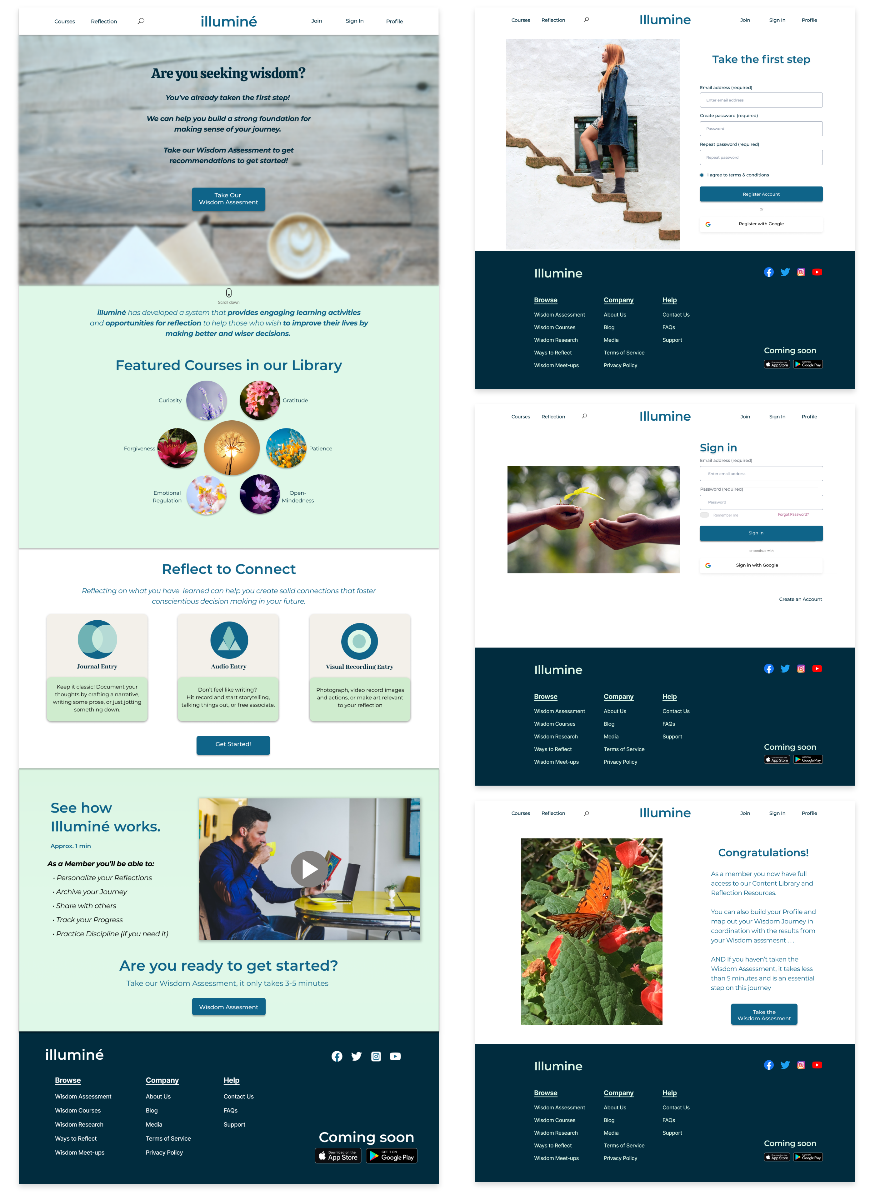
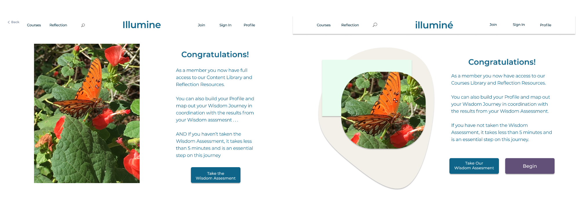
Iterated Desktop Wireframes
Once the style guide was established we applied new style to our wireframes. In our iterated prototype, we resolved the user’s pain points from testing, aiming to make the users experience more intuitive.
…as well as the wisdom assessment…
Iterated Mobile Wireframes
Applied the style guide to the mobile wireframes as well.
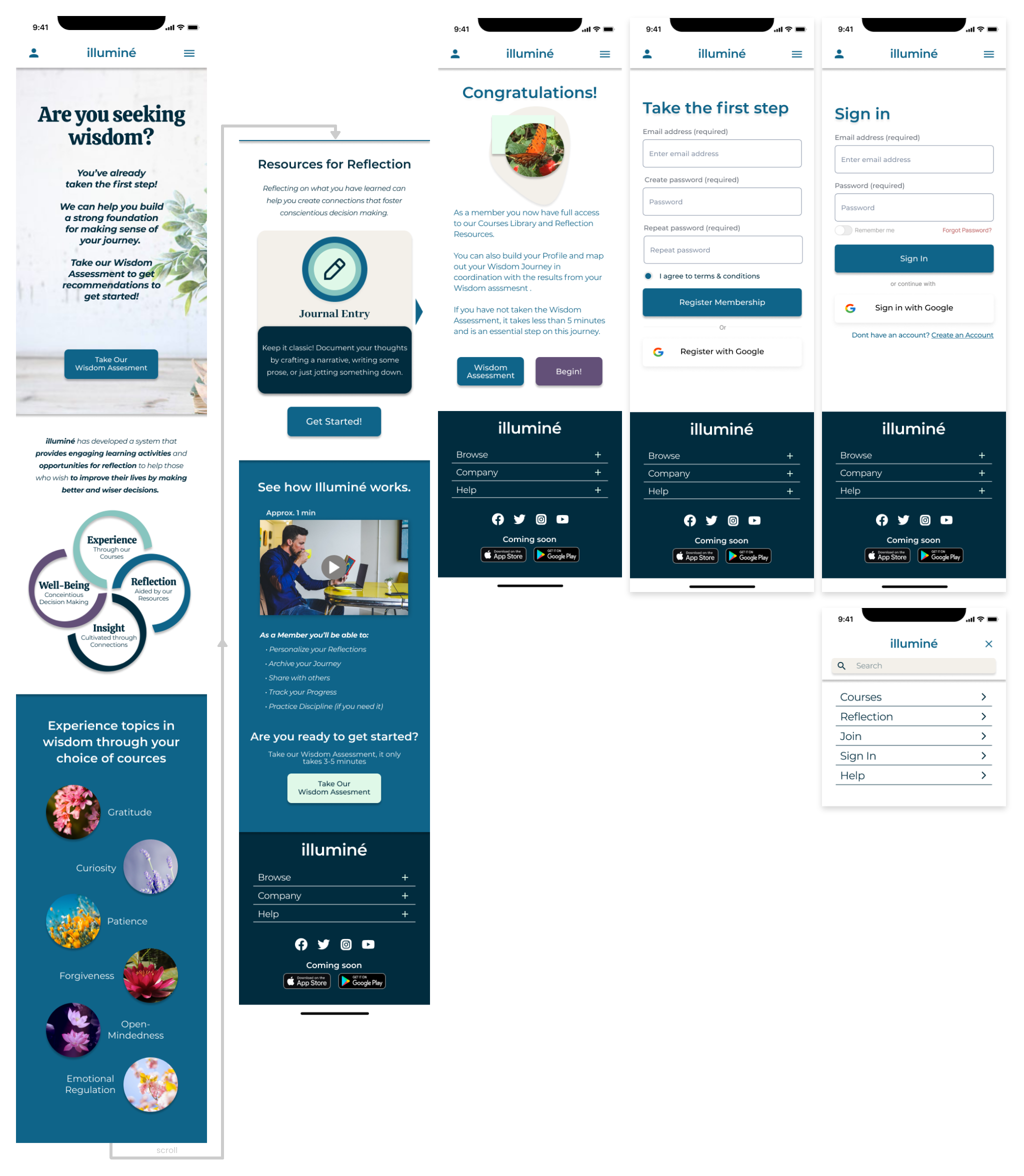
…as well as the mobile wisdom assessment…
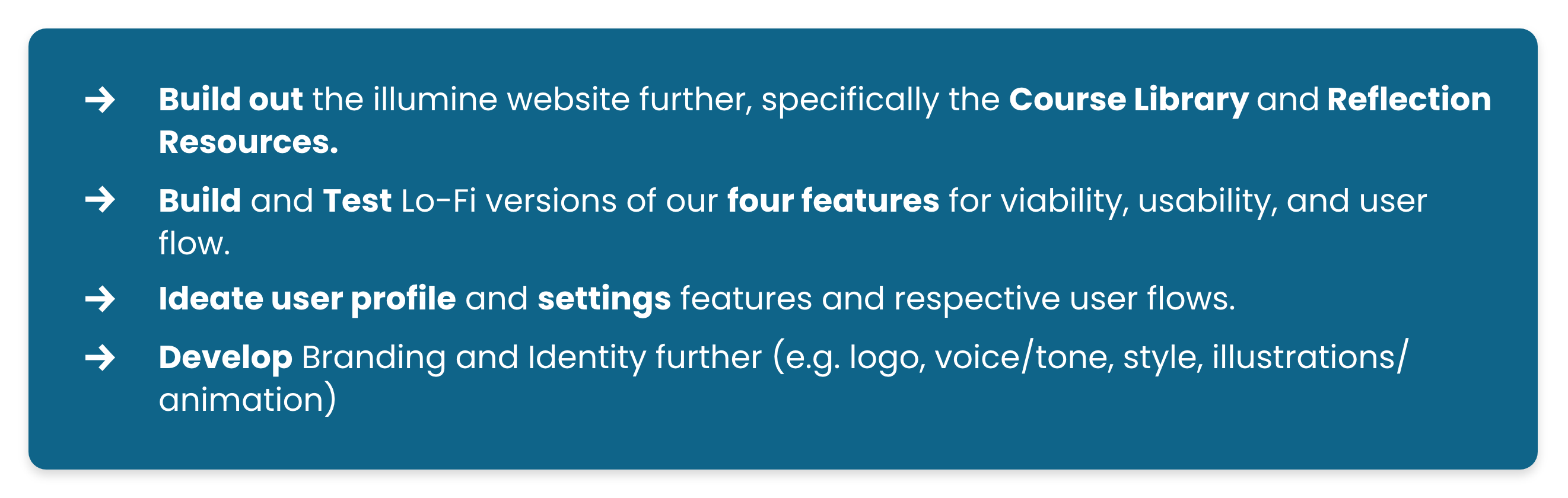
What's Next
For our next steps our team would love to…
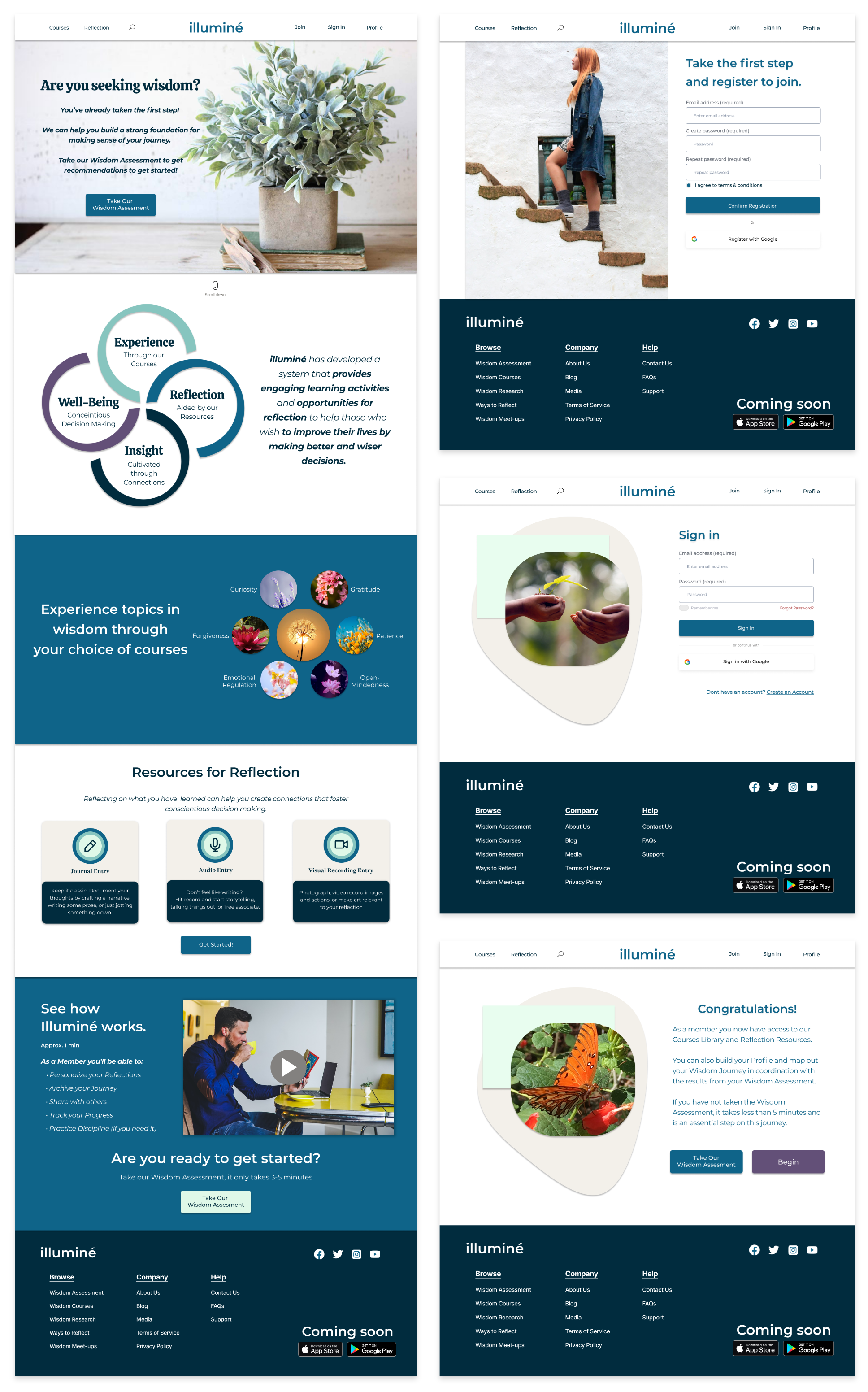
Final Prototypes
Hover over device to select prototype!